The best sales pitch for everyday automation remains IFTTT. No, I haven’t used that product in almost a decade, yet the name is just fabulous. “If This Then That”.

It’s that simple — in theory. Around 10 years ago when Microsoft Flow was launched, it didn’t primarily aim to be a business application automation tool, the way Power Automate is today. It supported consumer Microsoft accounts and potentially had something to offer anyone with a computer (or even just a phone).
As usual, things that start simple and clean will end up becoming complex and messy — especially if you sit at the very intersection of major Microsoft clouds. Microsoft 365, Dynamics 365, Power Platform and Azure have all stretched the simple idea behind Flow into what we see today. In this newsletter issue, I’ll reflect on what is happening with Power Automate and how it keeps manifesting itself in user experience woes.
First, I’ll walk through what very recently went wrong with the V4 flow designer launch. Then, I’ll explain why makers are increasingly relying on community tools to stay productive. Finally, I’ll drill deeper into how the silent but obvious Power Automate and Logic Apps split hints at a Copilot-first future that threatens to leave the everyday cloud flow usage in existing business processes behind.
Power Automate GUI struggles
The original flow designer was fairly modern at the time. For simple “if this then that” logic, it was probably just fine. Yet because Microsoft chose to make Power Automate also the enterprise business process automation solution, it meant the same tool had to cater to vastly more complex scenarios. Thanks to its limited integration with native Dataverse concepts (parity with the full-GUI XRM workflows never arrived), you often needed to work with formulas and OData filter queries in even basic CRM automation tasks.
The clumsy editor was a big reason why I’ve never enjoyed working with flows. Microsoft surely has been aware of the challenges. As a result, they tried to address several UX issues that were hampering power user productivity by launching The New Designer. After preview, it went GA in November 2023. Yet two years later, many users were still resorting to the classic designer due to errors, compatibility issues and simple neglect on Microsoft’s part to make V3 the default experience when accessing flows from the Power Apps side (or run history, or wherever). There was a lot to like about V3’s improvements, but someone just forgot to finish the job — most likely due to resources getting reallocated to Copilot.
Let’s fast forward to 2026. There have not been many updates to Power Automate cloud flow promised in the release plans, which is something I called out in the “Error: roadmap not found” part of my August newsletter issue already. For good and bad, that doesn’t mean things wouldn’t be changing. If you’re in a position to keep an eye on the restricted-access M365 Message Center, you might have noticed MC1218891:
Would you have realized that this message means there’s a new “V4” designer coming? That it reverses the sidebar UI of what V3 brought us over two years ago and takes things back to the oldskool? No? Well, unless you’re a Power Automate MVP, I don’t blame you for not connecting the dots.
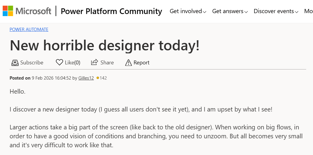
What happened next was… tragic. That’s the most descriptive word I can think of for good intentions gone so horribly wrong. While some “exciting news!” posts were also shared out on social media, many customers were outraged by how the editor had changed overnight:
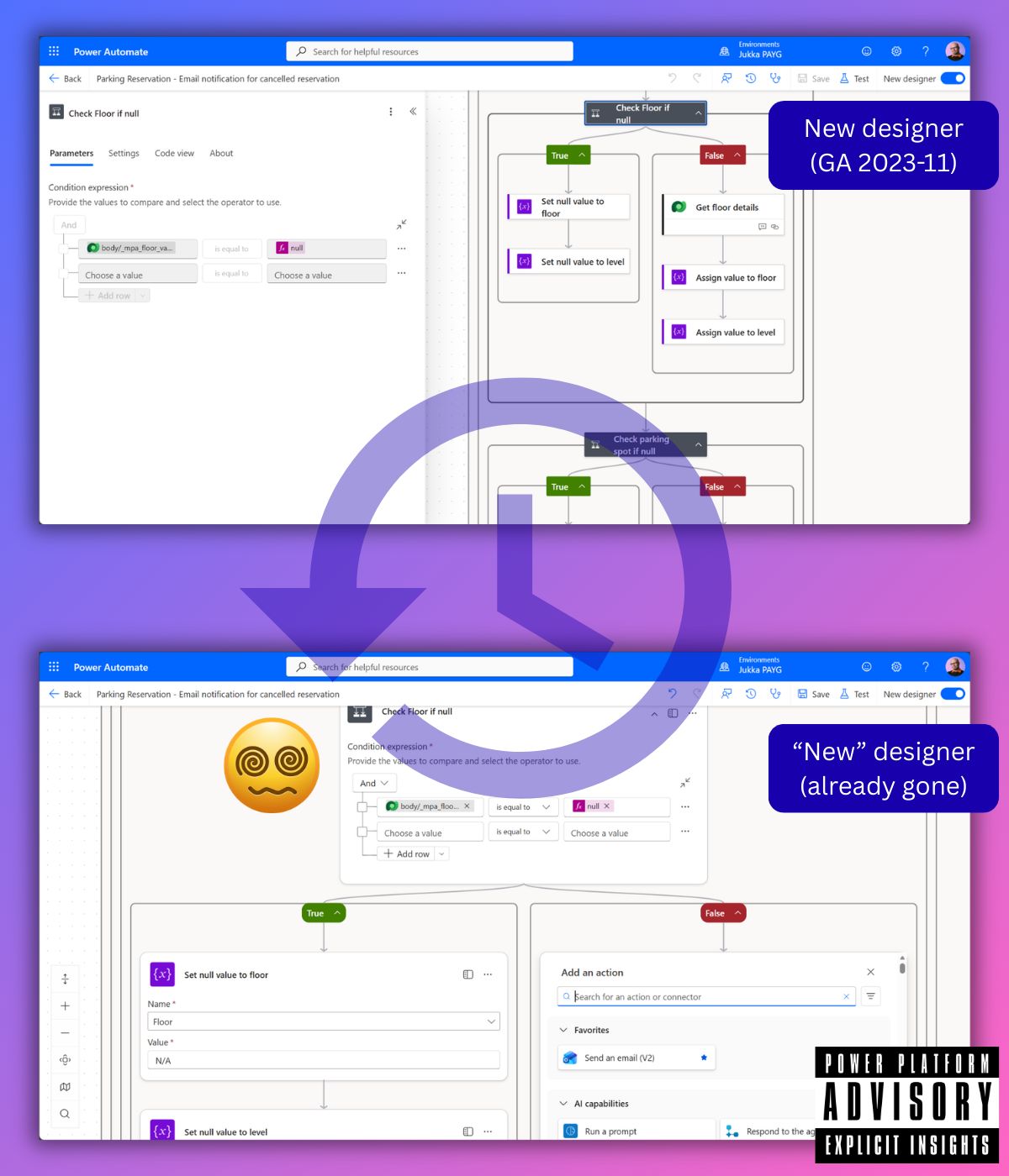
Since I’ve been working with quite a few complex cloud flows lately, I opened them in the new editor and examined how the experience had changed. On every occasion, my CPU started screaming as Edge was consuming all available memory. Trying to render the flow steps while I was expanding the logic proved to be a challenge for this editor. It had all worked fairly smoothly (from a resource use perspective) in the previous two editors. Now, it felt like Power Automate was seeing such flow definitions for the very first time and freaking out.
Even if the code wasn’t as inefficient as it obviously was, the new designer delivered the classic “modernize the UI” treatment we’ve seen across Microsoft products. Meaning: with every new UI update, you see less of your data and more of useless whitespace or UI chrome. In the case of flow, the situation had now gone from bad to worse. Understanding the automation big picture became an even greater challenge than before.
Then, two days later, the “new” designer was gone. Microsoft had silently reverted the UI back to V3, which used to be the New designer.
What happened? Well, first of all, it’s encouraging that the frustration and issues reported by customers online made Microsoft roll back the changes so fast. Now, the question that remains unanswered is: “How could something like this happen in the first place?!?”
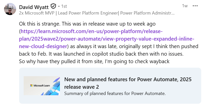
There’s not a lot of info besides community comments to go on at this stage. The M365 message center announcement has been deleted. I also saw reports about the 2025 release wave 2 plans having been changed:
Indeed, when we go and look at the change history page on MS Learn, we see an entry for “View property value expanded inline in the new cloud flow designer” feature. It says the feature had been removed from the plans on Jan 30, 2026, with the reason “moved to the next release wave”. Well, we all know this is simply not true since the feature rolled out straight into production for all Power Automate customers on Feb 9th anyway.
Who approved the deployment? Has GitHub Copilot at MSFT become fully autonomous by now? Is this why crazy “features” like locking down the plan/project Dataverse table in Microsoft Planner keep happening lately? Is the reason for the zero communication coming from Microsoft simply because no human knows how the organization operates anymore? Hello, is anyone there?
The only good flow UI is the one you build yourself
I am positive that there are lots of folks in Microsoft product teams that are trying to do the right thing. Yet the current incentives that top management have put in place are directing the machine to deliver features and changes that are serving their own interest, not the customers’. The KPIs are actively hostile, especially when it comes to user experience.
Here’s one challenge for you, to illustrate things: how quickly can you find the flow runs in the Power Automate maker portal today?
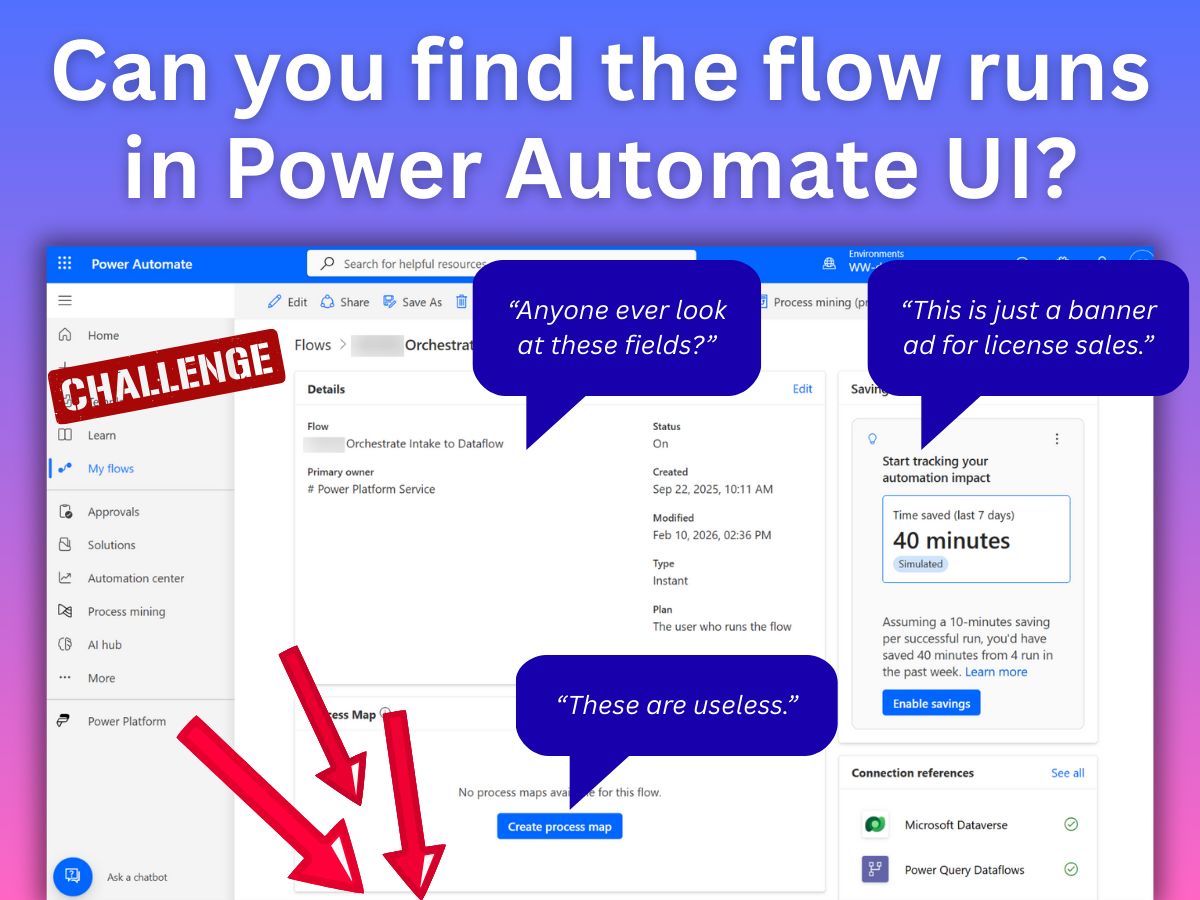
Cloud flow details page, with a bunch of crap that pushes the flow runs below the fold.
Unless you turn your widescreen monitor sideways (vertical mode), you won’t see that information directly today. Because at the top there’s a bunch of either static information that’s always been there (without anyone questioning the priority) or advertisements for new features that aim to drive the MAU metrics (active users) that Microsoft PMs are measured on. The user needs to scroll past a bunch of crap to get to what really matters in real life: when did my flow last run and what was the outcome?
The insulting part is that all the data needed for constructing a productive UX is already there in the platform. Microsoft is just ignoring the needs of software users who build cloud flow automations as part of their jobs. There’s apparently no KPI for power user productivity. Which means the power users need to take things into their own hands and build custom UIs for fixing the Power Automate UI gaps.
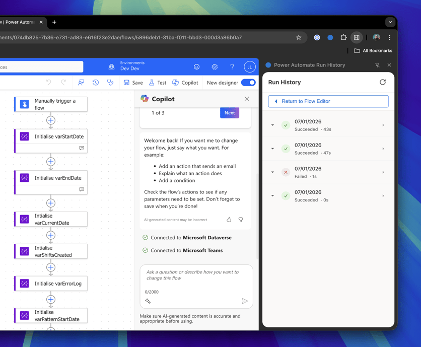
The above example is Flow Run Buddy, a browser extension that renders the ever so relevant flow run details in a persistent sidebar. Built with Claude Code and GitHub Copilot as a vibe coding project by a Power Platform consultant. Now, I’m sure that a Microsoft UI would have to meet all kinds of requirements for accessibility etc. to get out the door, yet these small extensions demonstrate what the official Microsoft products could well offer you. Or more precisely: should offer.
Instead, the Power Automate cloud flow UI feels like a persistent obstacle that stops me from getting work done. But these days, when you get frustrated enough, you can just tell your problems to a tool like Claude and it will spit out functioning code in a few minutes. Like what I’ve done with my Power Bookmarklets repo that contains quick scripts that I can either add directly as bookmarks or Tampermonkey scripts and make things like cloud flow JSON immediately accessible and summarized in the browser:
For bigger tools, there’s currently 11 Power Automate plugins in the XrmToolBox Plugin Catalog for anyone to browse. The newer Power Platform ToolBox is also getting new cloud flow related tools, making the experience even more modern. When the vendor fails to deliver, the community will step in. That’s what “Power” in the product names really stands for.💪
Power Automate 💔 Azure Logic Apps
On a deeper technical level, the symptoms of UX erosion/stagnation in Power Automate cloud flows are related to the bigger shift taking place. To use the cliched ChatGPT phrase, “no one talks about” how cloud flows are no longer a layer on top of Logic Apps. This change hasn’t received much attention online, so I decided to vibe code a summary page of the key details and publish it on my Vibes site.
As mentioned at the beginning, Power Automate (then MS Flow) started as “Logic Flows” built on top of Azure Logic Apps. Initially just an element of Power Apps (or “PowerApps” as it was spelled), it didn’t try to reinvent the underlying runtime but rather focused on making the elements from Azure available in the context of business users. In a way, it was “just” a layer on top of Logic Apps. The path of converting flows into Logic Apps was actively promoted in the UI for some time, supporting the “no cliffs” idea of starting with no-code and evolving to pro-code on the one Microsoft stack.
In 2025, the runtime architecture went through a breakup process. Let’s explore the details from the above summary page:
Subscribe to Plus to read the rest.
Become a paying subscriber of Perspectives Plus to get access to this post and other subscriber-only content.
Upgrade


